Most Shopify stores are leaving money on the table, and it usually has nothing to do with the product. The platform wide average conversion rate sits around 1.4 to 1.8 percent, meaning fewer than 2 out of every 100 visitors buy anything at all, while the top 20 percent of stores convert above 3 percent and the top 10 percent clear 4.5 to 5 percent. The gap between an average store and a genuinely high-converting one is rarely a better product. It is almost always a better experience: faster pages, clearer product pages, less friction at checkout, and a mobile experience that was actually designed for mobile rather than squeezed into it.
This guide walks through everything that separates an average Shopify store from a high-converting one, in the order it actually matters. It covers strategy and planning, product page design, trust and social proof, checkout optimization, page speed, mobile UX, personalization, and the testing process that keeps a store improving after launch. Every section includes current 2026 data so you can prioritize by actual impact rather than guesswork, and practical steps a Shopify development team, an in-house marketer, or a solo founder can act on directly.
- 1. What "High-Converting" Actually Means
- 2. Get the Foundation Right Before You Optimize Anything
- 3. Why Traffic Quality Changes Every Number in This Guide
- 4. Choosing and Setting Up Your Shopify Theme
- 5. Homepage and Navigation That Guide, Not Distract
- 6. Product Pages That Actually Convert
- 7. Trust Signals and Social Proof
- 8. Cart Page and Micro-Conversions
- 9. Checkout Optimization: The Highest-Leverage Work on Your Store
- 10. Page Speed and Core Web Vitals
- 11. Mobile-First, Not Mobile-Tolerant
- 12. Personalization and Post-Purchase Growth
- 13. Apps: What to Add and What to Avoid
- 14. Analytics and Attribution: Measuring What Actually Moved
- 15. Testing and Continuous Optimization
- 16. Common Mistakes That Quietly Kill Conversion Rate
- 17. A 90-Day Launch and Optimization Plan
3. Why Traffic Quality Changes Every Number in This Guide
Every conversion rate benchmark in this guide is meaningless without accounting for where the traffic is coming from, because traffic source alone can swing conversion rate by four or five times within the same store. Email traffic commonly converts around 4 to 5 percent, organic search around 2.7 to 3 percent, and paid social as low as 0.7 to 1.2 percent, because each channel carries a different level of buying intent. A visitor who searched for your exact product name is close to buying already. A visitor interrupted mid-scroll on a feed is not.
This has a direct, practical implication for how you read your own dashboard. If your blended conversion rate looks weak, check your traffic mix before assuming the store itself is the problem. A new store still leaning heavily on paid social and organic social traffic will show a lower blended rate than an established store with a mature email list and steady direct traffic, even with an identical storefront. As you build owned channels, email, SMS, and repeat direct traffic, your blended conversion rate improves on its own, independent of any design change.
- Segment your analytics by traffic source before drawing conclusions about product page or checkout performance, since a low blended average can hide strong performance on your best channels.
- Treat paid social traffic conversion separately from organic and email traffic conversion, since blending them together consistently produces a misleadingly low overall number for younger stores.
- Invest in list building and retention early. Returning customers convert at several times the rate of first-time visitors, so a growing email list steadily lifts blended conversion rate over time, on top of anything checkout or product page work achieves.
1. What "High-Converting" Actually Means
Before changing anything on your store, it helps to know what you are actually aiming for. "Good conversion rate" is one of the most misused phrases in ecommerce, mostly because people compare their store against a single blended average that hides enormous variation by industry, price point, and traffic source.
- The platform wide average Shopify conversion rate sits at roughly 1.4 to 1.8 percent.
- Stores in the top 20 percent convert at 3.1 to 3.5 percent or higher.
- Stores in the top 10 percent convert at 4.7 to 5.2 percent.
- Conversion rate varies heavily by category. Food and beverage, beauty, and pets often convert at 3 to 6 percent, while jewelry, luxury goods, and B2B commerce often sit at 0.8 to 2 percent due to higher price points and longer decision cycles.
- Desktop converts noticeably higher than mobile, typically around 1.9 to 4 percent on desktop versus 1.2 to 2.5 percent on mobile, even though mobile now drives well over half of ecommerce traffic.
- Traffic source matters as much as design. Email traffic commonly converts around 4 to 5 percent, organic search around 2.7 to 3 percent, and paid social as low as 0.7 to 1.2 percent.
The practical takeaway is to benchmark against your own category, your own traffic mix, and your own price point, not against a headline number pulled from an unrelated business. A luxury jewelry store converting at 1.2 percent may be performing excellently. A beauty store converting at 1.2 percent likely has real room to improve. Everything in this guide is aimed at moving a store from wherever it sits today toward the top quartile of its own category, not at chasing an arbitrary universal target.
2. Get the Foundation Right Before You Optimize Anything
A high-converting store is built on a specific, believable offer before it is built on design polish. No amount of checkout optimization rescues a store selling an undifferentiated product at an uncompetitive price to the wrong audience. Before touching a theme file, get clear on four things: who exactly you are selling to, what makes your product a better choice than the obvious alternative, what your actual margin allows you to spend on acquisition, and which single traffic channel you will prove the model on first.
This matters for a very practical reason. Every tactic in this guide, from product photography to checkout copy, performs differently depending on your answer to those four questions. A considered $400 purchase needs more trust building and more product education than an impulse $25 purchase. A brand competing on craftsmanship needs different homepage messaging than a brand competing on price. Getting this foundation wrong is the single most common reason otherwise well-executed stores still underperform.
Know Your Margin Before You Design Anything
Conversion optimization is ultimately a margin conversation, not just a design one. A store with thin margins cannot afford the same acquisition cost per order as a store with healthy margins, which means the two stores should be making different tradeoffs on everything from paid traffic to free shipping thresholds. Work out your true landed cost per unit, including shipping and payment processing fees, before setting a free shipping threshold or a discount strategy. A free shipping bar that pushes average order value up but quietly erodes margin below breakeven is a conversion win and a business loss at the same time.
Match the Store's Tone to How the Purchase Actually Feels
A shopper buying a $25 phone case is in a different mental mode than a shopper buying a $600 mattress. Impulse-category stores can lean harder on urgency, bold visuals, and a short path to checkout. Considered-purchase stores need more explanation, more proof, and a slower, more reassuring path, since rushing a high-consideration buyer tends to increase abandonment rather than reduce it. Look honestly at where your product sits on that spectrum before copying tactics wholesale from a store selling something fundamentally different.
4. Choosing and Setting Up Your Shopify Theme
Your theme decision affects almost everything downstream, from page speed to how much custom work later optimization will require. For most stores, starting with a modern, well-built theme and customizing it is faster, cheaper, and ultimately more conversion-friendly than commissioning a fully custom build before you have validated demand.
- Free Shopify themes built on Online Store 2.0, such as Dawn, work well for most stores and customize reasonably far before hitting real limitations.
- Premium themes typically add stronger built-in conversion features, such as sticky add-to-cart bars, better image galleries, and pre-built trust modules, and usually cost 100 to 350 dollars one time.
- Theme customization, meaning custom sections, branded styling, and product page overhauls on an existing theme, typically runs 600 to 3,500 dollars with a freelancer or small agency.
- A fully custom theme built from scratch typically runs 3,000 to 15,000 dollars or more, and is best justified once a store has validated its offer and outgrown what an existing theme's structure can support.
When evaluating a theme, prioritize four things over visual style alone: how well it performs on Core Web Vitals out of the box, how flexible its sections are without needing custom code for every change, how clean its checkout and cart drawer implementation is, and how well its default mobile layout actually works rather than merely resizing. A beautiful theme that loads slowly or breaks on mobile will underperform a plainer theme that is fast and clean, every time.
5. Homepage and Navigation That Guide, Not Distract
The homepage's job is not to sell every product at once. It is to orient a new visitor in under three seconds and move them toward the two or three paths most likely to convert: a bestseller collection, a clear value proposition, and obvious navigation. Overloaded homepages with a dozen competing sections and messages routinely underperform focused ones.
- Lead with a single clear value proposition above the fold, not a rotating carousel of five different messages competing for attention.
- Surface bestsellers or a tightly curated entry collection rather than forcing visitors to hunt through full navigation.
- Keep primary navigation to a small number of clear categories. Deep, cluttered mega menus increase decision fatigue rather than helping people find what they want.
- Use search prominently. Shoppers who use on-site search convert at a meaningfully higher rate than those who browse, since search signals stronger intent, so make sure search is fast, forgiving of typos, and returns relevant results.
- Avoid stacking more than two or three trust or social proof elements on the homepage itself. Save the heavier reassurance work for product and checkout pages, where the buying decision actually happens.
6. Product Pages That Actually Convert
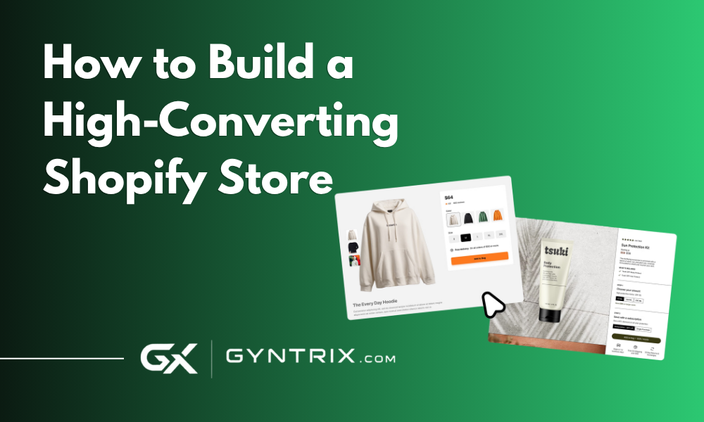
The product page is where most of the real conversion work happens, and it is also where most stores leave the most avoidable revenue on the table. The average ecommerce product page converts somewhere around 1.5 to 3.5 percent on cold traffic, while top-performing pages reach 4 to 8 percent, and the difference is rarely the product itself.
Product Titles and Descriptions
A title that communicates product type, use case, and a concrete specification removes ambiguity before a shopper even reads the description. Descriptions should answer the questions a shopper is actually asking: what is this, who is it for, what problem does it solve, what makes it different, and what are its honest limitations. A description that oversells and avoids any downside tends to read as less trustworthy than one that is precise and balanced.
Product Photography and Media
- Show the product from multiple angles, in use, and at true scale, since scale and context are two of the most common sources of buyer hesitation.
- Include at least one lifestyle or in-use image alongside clean studio shots, since context helps shoppers picture ownership.
- Add short product video where it genuinely clarifies fit, texture, or function, not as a default for every SKU.
- Compress and serve images through a CDN, since bloated, unoptimized product images are one of the most common causes of slow product pages.
Specific, Contextual Trust Elements Beat Generic Badges
Generic trust badges do very little on their own. Specific, contextual signals do a lot more work. "Ships from our warehouse in 1 business day" beats a generic shipping icon. "30-day no-questions-asked returns" beats a vague returns badge. "12 left in stock" creates real urgency where a generic "limited stock" banner does not. The pattern across current research is consistent: specificity converts, vagueness does not.
Mobile-First Layout on Product Pages
Since mobile now accounts for well over half of ecommerce sessions, product pages need a sticky add-to-cart button, a swipeable image gallery, and collapsible accordions for long specification or shipping content, rather than a desktop layout that has simply been squeezed narrower. A sticky add-to-cart bar alone has been shown to meaningfully lift add-to-cart rates on mobile, since it removes the need to scroll back up after reading through the page.
7. Trust Signals and Social Proof
Trust is not a single element, it is a stack of smaller signals that compound. Current research on social proof stacking is specific about the right amount: a combination of 3 to 5 different proof types, such as star ratings, review counts, testimonials, user-generated content, and recognizable brand or press logos, lifts conversion meaningfully over a page with no proof at all. Interestingly, piling on more than 5 types produces sharply diminishing returns, so the goal is a well-chosen handful, not an exhaustive wall of badges.
- Products displaying genuine customer reviews convert at roughly 3.5 times the rate of otherwise identical products without reviews.
- The large majority of shoppers check reviews or ask for recommendations before buying, making review visibility one of the highest-leverage trust elements available.
- Specific, well-placed trust badges around payment security and returns have been shown to lift conversion meaningfully, but only when they are visible near the point of decision, not buried in a footer.
- User-generated content, real customer photos and videos, increasingly outperforms polished studio photography alone for building purchase confidence, particularly in fashion, beauty, and home goods.
Place the strongest proof near the add-to-cart button and again near checkout, since those are the two moments where hesitation is most likely to end the session. A five-star rating with a visible review count directly under the price does more work than the same rating buried at the bottom of the page.
8. Cart Page and Micro-Conversions
The cart is a frequently under-optimized step between the product page and checkout. A few adjustments here consistently recover otherwise lost orders.
- Show a free shipping progress bar when a store offers a shipping threshold, since visible progress toward a reward reliably increases average order value.
- Keep the cart accessible as a slide-out drawer rather than forcing a full page reload, which reduces a point of friction and keeps shoppers in a browsing state longer.
- Surface a small number of relevant cross-sells or add-ons in the cart itself, not the entire catalog, since an overloaded cart page competes with the primary goal of completing checkout.
- Make quantity changes, removals, and promo code entry frictionless, since a clunky cart interaction is a common, easily fixed source of abandonment before checkout even begins.
9. Checkout Optimization: The Highest-Leverage Work on Your Store
If you only fix one thing after reading this guide, fix checkout. It sits closer to revenue than almost any other page on the store, because by the time someone reaches it, they have already decided to buy. Every point of friction from here on is pure, avoidable revenue loss.
- Average cart abandonment across ecommerce sits around 70 percent, a number that has stayed roughly consistent across dozens of studies.
- The most commonly cited fixable reasons for abandonment are unexpected extra costs, slow estimated delivery, payment distrust, and forced account creation, all of which are checkout design problems a store fully controls.
- A healthy blended Shopify checkout completion rate, meaning the share of shoppers who start checkout and finish it, is roughly 45 to 55 percent. Below 40 percent signals real friction. Above 60 percent is elite territory, usually driven by a strong returning-customer mix.
- Mobile checkout completion typically runs 8 to 15 percentage points behind desktop within the same store, making mobile checkout speed a priority rather than an afterthought.
- Shop Pay, Shopify's accelerated checkout, can lift checkout conversion by roughly 50 to 91 percent compared to standard guest checkout, with the largest gains on mobile, and costs nothing to enable.
- Baymard Institute research finds that improving checkout design alone can lift conversion by roughly 35 percent on large sites, independent of any traffic or product changes.
Checkout Optimization Checklist
| Fix | Why It Matters |
|---|---|
| Enable Shop Pay, Apple Pay, and Google Pay | Removes manual form entry entirely for returning and first-time buyers alike, the single highest-ROI checkout change available |
| Offer guest checkout by default | Forced account creation is one of the most cited reasons for cart abandonment |
| Show shipping costs and estimated delivery early | Unexpected costs revealed at the final step is the single largest abandonment cause across studies |
| Use Shopify's one-page checkout where available | Fewer page loads and fewer steps reduce the number of moments someone can stall or reconsider |
| Strip optional form fields | Every unnecessary field is a small increase in friction and a small increase in abandonment risk |
| Add visible security and payment trust signals at the payment step | Payment distrust is a top cited reason for abandoning at the final step specifically |
Diagnose before you redesign. Pull step-by-step funnel data from Shopify Analytics or GA4 and find the single stage with the largest drop-off, cart to information, information to shipping, or shipping to payment, rather than making broad changes across the whole flow at once. Most stores have one stage performing two to three times worse than the others, and that is where optimization budget should go first.
Checkout Completion Benchmarks by Segment
| Segment | Typical Checkout Completion Rate |
|---|---|
| Blended average, all traffic and devices | 45% to 55% |
| Bottom quartile stores | Below 38% |
| Top quartile stores | 52% to 58% |
| Top decile stores | 60% to 75% |
| Desktop within the same store | 8 to 15 points above mobile |
| Returning customers | 10 to 20 points above first-time visitors |
If your store sits at the median, a realistic 90-day target after focused optimization is a 5 to 10 percentage point improvement, which typically translates to a 12 to 25 percent relative lift in completed orders on the same traffic. Bottom-quartile stores tend to see the largest early gains, often 8 to 15 points, since the first fixes address the most obvious friction. Top-quartile stores see smaller, harder-won gains from that point forward, which is normal and simply reflects diminishing returns as the easy wins run out.
10. Page Speed and Core Web Vitals
Speed is not a technical nice-to-have, it is one of the most directly revenue-linked levers a store has, and it sets a ceiling on how much every other optimization in this guide can achieve. A beautifully designed, well-written product page still underperforms if it takes four seconds to become interactive.
- A one-second delay in mobile load time has been shown to reduce conversions by roughly 7 percent in widely cited Google and Deloitte research.
- Every additional 100 milliseconds of load time costs roughly 1 percent in conversions on average, a relationship that has held up consistently across large-scale A/B testing.
- Sites that pass all three Core Web Vitals thresholds, Largest Contentful Paint, Interaction to Next Paint, and Cumulative Layout Shift, see meaningfully lower bounce rates and 15 to 30 percent higher conversion rates compared to sites that fail.
- Only roughly 33 to 42 percent of ecommerce sites currently pass all three Core Web Vitals on mobile, meaning most competitors are still vulnerable on this exact metric.
- Documented real-world case studies show the scale of the payoff: one major retailer saw a 53 percent increase in revenue per visitor after improving LCP, another saw an 8 percent sales lift from a 31 percent LCP improvement, and a third saw mobile product page conversion more than double after prerendering key pages.
The practical targets to aim for are LCP under 2.5 seconds, INP under 200 milliseconds, and CLS under 0.1, tested on real mobile conditions rather than a fast office wifi connection. The most common culprits on Shopify stores are unoptimized product images, too many installed apps injecting their own scripts, and heavy, unnecessary JavaScript running on every page rather than only where it is needed. A performance audit that identifies the actual bottleneck, rather than guessing, is almost always worth the time before making broader design changes.
11. Mobile-First, Not Mobile-Tolerant
Mobile commerce now accounts for well over half of ecommerce sessions and a majority of traffic for most stores, yet mobile conversion rates still trail desktop meaningfully across nearly every category. That gap is rarely about mobile shoppers being less interested. It is about mobile experiences that were designed on desktop first and adapted afterward, rather than built mobile-first from the start.
- Design the mobile layout first, then adapt it up to desktop, rather than the reverse, since this forces genuinely necessary content and interactions to the front.
- Use a sticky add-to-cart bar and a sticky checkout button so the primary action is always reachable without scrolling back up.
- Avoid hover-only interactions entirely, since they simply do not exist on a touch device and often hide important content from mobile shoppers by accident.
- Test your actual checkout flow on a real mid-range phone over a real mobile connection, not just in a desktop browser's device emulator, since emulators routinely understate real-world load times.
- Prioritize thumb-reachable placement for primary buttons, since one-handed phone use is the norm, not the exception.
12. Personalization and Post-Purchase Growth
Personalization has moved from a nice differentiator to a meaningful conversion lever. A large majority of shoppers report being more likely to buy from a brand that tailors the experience to them, and stores using real-time, behavior-driven personalization report double-digit conversion uplifts compared to a static, one-size-fits-all layout.
- Show recently viewed products and relevant recommendations based on browsing behavior rather than a single generic bestsellers block for every visitor.
- Segment email and SMS flows by purchase history and browsing behavior rather than sending identical campaigns to the entire list.
- Automate abandoned cart recovery. It is consistently one of the single highest-revenue automations a store can run, since it re-engages shoppers who have already shown strong purchase intent.
- Reward returning customers specifically. Returning customers convert at several times the rate of first-time visitors, so retention-focused offers often produce a better return than acquisition spend alone.
13. Apps: What to Add and What to Avoid
Apps are one of the fastest ways to both improve and quietly damage conversion rate, often at the same time. Most functional stores run somewhere between 2 and 5 paid apps for things like reviews, upsells, email marketing, or subscriptions, but every additional app is also additional JavaScript competing for the same page load budget.
- Prioritize apps that directly touch the buying decision: reviews, upsells at the right moment, and cart or checkout enhancements, over apps that only add marginal marketing convenience.
- Audit installed apps periodically and remove ones no longer actively used, since abandoned app scripts are a surprisingly common, invisible source of slow page speed.
- Favor apps built specifically for Online Store 2.0 themes, since older app architectures tend to inject more render-blocking code.
- Test page speed before and after installing any new app that touches the product, cart, or checkout page, rather than assuming it is neutral.
14. Analytics and Attribution: Measuring What Actually Moved
None of the previous sections mean much without a reliable way to measure whether a change actually worked. A surprising number of stores make decisions off gut feel or a single day's numbers, which is close to meaningless given normal day-to-day variance in ecommerce traffic and orders.
- Set a minimum measurement window before drawing conclusions, generally at least 30 days for an established store, and 60 to 90 days for a lower-traffic store, since conversion rate needs a meaningful sample size to be statistically reliable.
- Cross-reference Shopify Analytics against Google Analytics 4 periodically, since tracking discrepancies between the two are common and worth understanding rather than ignoring.
- Track conversion rate by device and by traffic source separately, not just as a single sitewide number, since averaging across very different segments hides exactly the insight you need to act on.
- Watch checkout funnel completion as its own metric, distinct from overall site conversion rate, since it isolates the highest-leverage part of the journey from everything upstream of it.
- Treat revenue per session, conversion rate multiplied by average order value, as a more complete health metric than conversion rate alone, since a lower conversion rate at a higher average order value can still mean more revenue per visitor.
Good measurement does not need to be complicated to be useful. A store that reliably tracks conversion rate by device, by traffic source, and by checkout stage, and revisits those numbers on a consistent monthly cadence, will out-optimize a store making frequent but unmeasured changes almost every time.
15. Testing and Continuous Optimization
A high-converting store is not a one-time build, it is an ongoing process. The stores consistently sitting in the top 10 to 20 percent of their category maintain an active testing program rather than shipping a design once and leaving it untouched for years.
- Instrument your funnel properly in Shopify Analytics or GA4 before testing anything, so you know where the real leak is rather than guessing.
- Prioritize tests by expected impact and required effort, starting with checkout and product page friction before cosmetic homepage changes.
- Run one meaningful change at a time on your highest-traffic pages so you can actually attribute the result to the change you made.
- Give tests enough traffic and time to reach statistical relevance, generally at least a few hundred conversions per variant, rather than calling a result after a few days.
- Document what you tested and what happened, win or lose, so the same idea does not get retested blindly a year later.
16. Common Mistakes That Quietly Kill Conversion Rate
- Redesigning the entire store at once instead of fixing the single biggest, measurable point of friction first.
- Treating trust badges as decoration rather than placing specific, contextual reassurance exactly where hesitation happens.
- Installing app after app without ever auditing their cumulative effect on page speed.
- Designing for desktop and calling the mobile version "responsive" rather than genuinely mobile-first.
- Forcing account creation before checkout, still one of the most cited and most easily fixed abandonment causes.
- Hiding shipping costs until the final checkout step instead of surfacing them early.
- Launching a custom theme rebuild before validating the offer on a simpler, faster setup.
- Chasing a generic industry-wide conversion benchmark instead of comparing against your own category and traffic mix.
- Skipping Core Web Vitals testing on real mobile conditions and relying on a fast office connection instead.
- Running cosmetic A/B tests on low-traffic pages while checkout friction goes untouched.
17. A 90-Day Launch and Optimization Plan
Weeks 1 to 2: Foundation and Audit
Confirm your offer, audience, and price point are validated. Audit your current theme, page speed, and checkout for the most obvious friction points. If you are starting fresh, choose a modern Online Store 2.0 theme rather than an outdated one.
Weeks 3 to 6: Core Build
Build out product pages with specific, contextual trust elements and proper mobile-first layout. Enable Shop Pay and every relevant accelerated checkout option. Set up abandoned cart automation and basic personalization such as recently viewed products.
Weeks 7 to 10: Speed and Mobile Pass
Run a full Core Web Vitals audit and fix the highest-impact issues, typically unoptimized images and unnecessary app scripts. Test the entire purchase flow on a real mid-range phone over a real mobile connection, not just a desktop emulator.
Weeks 11 to 13: Instrument and Test
Set up proper funnel tracking in Shopify Analytics or GA4. Identify your single largest drop-off stage and run your first focused test against it. Document the result and set a recurring monthly cadence for the next round of testing.
Gyntrix builds and optimizes Shopify stores around exactly this framework, starting with the theme and product page foundation, moving through page speed and Core Web Vitals work, and finishing with checkout and mobile optimization built to convert rather than just look finished. If your store's conversion rate is sitting below where your category typically performs, the fastest path forward is usually not a full redesign, it is finding the two or three specific friction points costing you the most orders and fixing those first.
If you want a second opinion on where your specific store is losing conversions, talk to Gyntrix about a conversion audit for your store. We can walk through your funnel data and tell you honestly which of the fixes in this guide would move the needle most for your specific traffic and category, and our broader ecommerce development and custom development teams can help implement whatever the audit turns up.
Frequently Asked Questions
What is a good conversion rate for a Shopify store?
The platform wide average sits around 1.4 to 1.8 percent. Above 2 percent is a solid result for most categories, above 3 percent puts a store in the top 20 percent, and above 4.5 to 5 percent is top 10 percent territory. Good benchmarks always depend on industry, price point, and traffic mix, so compare your store against its own category rather than a single blended number.
What is the single highest-impact change for Shopify conversion rate?
Enabling Shop Pay and the other accelerated checkout options is consistently the highest return, lowest effort change available. Shopify's own data shows Shop Pay can lift checkout conversion by roughly 50 to 91 percent compared to standard guest checkout, with the biggest gains on mobile, and it costs nothing to turn on.
How much does page speed actually affect Shopify sales?
Significantly. Widely cited studies put the impact at roughly a 7 percent drop in conversions for every one second of added mobile load time, and sites that pass all three Core Web Vitals thresholds see meaningfully lower bounce rates and higher conversion rates than sites that fail. For a large store, half a second of improvement can translate into six figures of recovered annual revenue.
Should I build a custom Shopify theme to increase conversions?
Not necessarily as a first step. Most conversion gains come from fixing product page content, checkout friction, page speed, and mobile UX on an existing theme before a custom rebuild is justified. A custom theme becomes worth it once a store has validated its offer and needs a codebase built specifically around its catalog, brand, and performance requirements.
How long does it take to see results from conversion optimization?
Checkout and page speed fixes often show measurable impact within days to a few weeks, since they remove friction on traffic you already have. Content and trust signal changes on product pages typically need several weeks of traffic to reach a statistically meaningful result. Broader structural changes, like a theme rebuild, need to be judged over a longer window since there is a learning curve on both sides.
Do I need a large budget to build a high-converting Shopify store?
No. Many of the highest-impact changes in this guide, enabling Shop Pay, fixing image sizes, offering guest checkout, adding specific trust copy, cost little to nothing beyond time. Budget matters more for custom theme work and deeper performance engineering, but a store can move meaningfully toward the top of its category through free and low-cost changes alone before that investment becomes necessary.